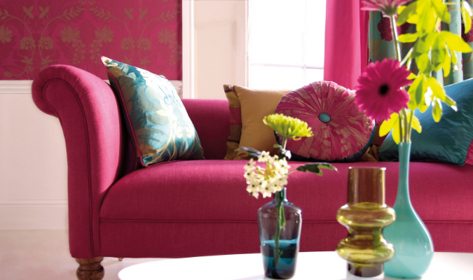
If you’re redecorating your home, you’ll know how perplexing it can be to filter through endless colour swatches in the DIY shop.
From burgundy to chartreuse, ‘sunshine yellow’ to ochre, the world of colour can be a confusing place to navigate. Neglect to do your homework, however, and you could end up with colour combinations that make your home décor look, well, amateur.
But don’t worry – you don’t need a PhD in design to decorate your home like a pro. All it takes is a little understanding of the colour wheel to get going.
Let’s jump right in.
What does the colour wheel mean?

They might just seem like a catalogue of colours, but colour wheels will be your most reliable tool when you’re choosing your next eye-catching décor. That’s because the colour wheel is guided by a special ‘positioning’ system; these dictate which colours work together – and which patently do not.
Generally speaking, there are three basic colour schemes which you can gleam from a colour wheel:
1. Tonal
This focuses on different shades of a single colour (which can be found in the same section of the wheel). For example, you might want to mix a deep purple with a lavender to drive home a purple theme.
2. Harmonious
This uses colours which are close to each other on the colour wheel, such as greens and yellows, blues and purples, or reds and oranges. This is usually a safe choice if you’re styling your home for the first time.
3. Complementary
This focuses on contrasting colours which are found on opposite sides of the colour wheel. This way of choosing a colour scheme is risky but it can create a high-impact look that really makes a statement.
Understanding your space

Now you know the basics of colour theory, it’s time to apply it to your home décor. But it’s not as simple as throwing a green throw over a yellow sofa cover and calling it a day – there needs to be a thematic thread running through all your furnishings.
From complementary scatter cushion colours to retro highlights in every room, there are some simple – but effective – ways you can style your home:
Develop a cohesive theme
You might have a breezy pink colour scheme picked out for your living room, but it won’t work if the next room along is bedecked in dramatic reds and blacks.
To make sure your décor sticks to a cohesive theme, find a base colour and stick to it. For instance, you might want to match a yellow wall in one room with a yellow rug in another; it is small highlights like this that keep a colour scheme focused.
Think about a room’s function
You might not notice it at first but look a little closer and you’ll soon realise the emotional pull of colour – and what it can say about your space.
Whites, light blues and greens, for instance, convey cleanliness (which makes them perfect for kitchens and bathrooms); deep browns, reds and purples, on the other hand, scream luxuriousness, so are ideal for bedrooms and larger-than-life living rooms.
Now you are well versed in the ways of colour theory, head over to Plumbs. Here, we have sofa fabrics, curtains and bedding available in more than 800 colourways – it really couldn’t be easier to upgrade your home décor.
